Defining Terms
The terms "usability" and "user experience" are sometimes used interchangeably, leading to confusion about the difference between these concepts. The relationship between usability and user experience can be understood as follows.
Usability
“Usability really just means making sure that something works well, that a person can use the thing without getting hopelessly frustrated.”
— Steve Krug, Don’t Make Me Think
When something is considered “usable,” it is typically…
- Learnable: easy for first-timers to understand
- Efficient: allows for quick and accurate accomplishing of tasks
- Memorable: intuitive and simple for repeat users
- Error-tolerant: prevents errors, and helps users recover from errors
- Satisfying: pleasant and engaging
Applying these usability concepts within design disciplines is often called “human-centered design.” Examples of these multi-disciplinary applications include:
- Furniture: the ergonomic design of Herman Miller furniture, that responds to the pressure points in the human body
- Products: the thoughtful design of Oxo Good Grips products, which revolutionized the design of everyday tools like can openers and vegetable peelers
- Places: the philosophy of making cities for people, championed by Jan Gehl and Jane Jacobs, that analyzes how humans inhabit spaces and designs accordingly

User Experience
Applying usability concepts within digital experiences is embodied by the user experience process. User experience as a field has really expanded with the evolution of digital products. The interaction between people and computers is more difficult to navigate than that of the physical environment -- think of all the physical and visual cues that a chair will provide in comparison to a two-dimensional desktop screen -- so making human-computer interactions more intuitive requires a careful, intentional process.
“[User experience is] every aspect of the user’s interaction with a product, service, or company that make up the user’s perceptions of the whole.”
— UXPA, Usability Body of Knowledge
Why UX Matters
Consumers today are faced with an overwhelming number of choices, information overload, and an abundance of data to use in decision-making. Humans also have an attention span of around 8 seconds. If a user cannot get their needs met through your tool or website in a very short amount of time, they will move on to the next option (of which there are plenty) or quit altogether. This is where user experience comes in: it is the glue that unites user needs with business needs, it is the medium through which a user experiences a business.
In today’s world of infinite choice, high quality design is a differentiator. Good UX enables a user to quickly and efficiently have their needs met by your tool or website — and this user optimization is now a bare minimum requirement that users expect. Great UX provides the user with a delightful and memorable experience that they want to have again — it increases brand recognition, loyalty, and retention.
- “In a recent study from Forrester Research, a well-designed user interface could raise your website’s conversion rate by up to a 200%, and a better UX design could yield conversion rates up to 400%. Put simply, the metrics speak for themselves.” — from Forbes
- “In Robert Pressman’s book Software Engineering: A Practitioner’s Approach, an early business justification for UX is made that’s hard to argue: ‘For every dollar spent to resolve a problem during product design, $10 would be spent on the same problem during development, and multiply to $100 or more if the problem had to be solved after the product’s release.’ This is to say that every dollar invested in UX returns $10 to $100, and correcting the problem from the start is most cost effective.” — also from Forbes
UX Activities
The field of user experience includes several activities:
- Research: understanding user behavior
- User Experience Design (UxD): mapping intuitive experience pathways
- User Interface Design (UiD): designing beautiful interfaces
- Interaction Design (IxD): creating transitions, microinteractions, and graphical animations
- Content Strategy: developing text, images, and other content that support product goals
- Prototyping: testing and iterating with users
Research
To effectively design for users, one first must understand what they need and want. This is where user research comes in -- it enables design and production teams to understand their users’ traits, behaviors, needs, and wants. Some activities that a user researcher might undertake include:
- Knowledge Gap Analysis: outlining what is known about users, and what still needs to be understood
- Interviews and Observations: talking directly to users through one-on-one interviews or focus groups, or observing target users in their environment
- Comparative Assessment: researching related tools that users are likely to encounter alongside yours (i.e., while Lyft doesn’t directly compete with Google Maps, they should be aware of the precedents set by Google Maps for mobile geolocation)
- Competitive Assessment: researching the direct competition to understand what users prefer, what needs are not being met, and where your tool’s competitive advantages lie
- Personas: synthesizing user research into user groups that summarize the key target audiences, include user stories, and can be used as checkpoints for the design team
User Experience Design (UxD)
User experience design is essentially the brains of a design: how the tool is structured to make the user’s flow through the tool logical and easy to grasp. An important concept here is the idea of the user’s mental model, the idea that a user has a mental picture of logic for how a tool works that the design of the tool should help to either reinforce or adjust. Some examples of user experience design activities include:
- Heuristic Markups: assessing all of the screens of a tool from the perspective of a user, marking up confusing elements
- Content Patterns: establishing hierarchy for repeated content types
- Information Architecture: outlining the “map” of a tool or website; determining where information lives within the tool or website
- Task Flows: mapping the pathways that a user could take through a tool to discover new information, accomplish tasks, and meet their needs
- Sketchy Wireframes: translating the structure of a tool into screens, sketching visual hierarchy of content on a page
User Interface Design (UiD)
User interface design picks up where user experience design leaves off; UI design involves designing the details of an interface using best practices for human-computer interaction in combination with the traditional graphic design elements of color, type, pattern, hierarchy, and more. Interaction design (IxD) is a term often used interchangeably with UI design. Visual design is also a term often used interchangeably with UI design, though visual design really focuses more on the look and feel of the tool rather than the interactivity. Some examples of user interface design activities include:
- Design Vision: articulating principles for the general look and feel of the tool (i.e., elegant and reserved vs. punchy and fun)
- Digital Wireframes: translating hand-drawn wireframes into digitized wireframes
- Pixel-Perfect Mockups: developing wireframes into fully realistic and interactive mockups
- Branding: similar to design vision, but involves creating logos, color palette, font choices, verbal tone, and more
- Visual Tone: developing interface patterns, components, and layout rules that reflect the design vision and branding, that can be carried throughout the tool for consistency
Interaction Design (IxD)
Interaction design is a sub-category of user interface design that focuses specifically on the motion effects that are part of a tool. These motion effects can be categorized as transitions, microinteractions, and graphical animations. Transitions include the motions that happen when the tool is moving between two different states, such as a fade-in to a modal overview or a slide effect between images in a gallery. Microinteractions are subtler embedded effects that give the user reinforcing feedback as they interact with the interface (for example, a bounce effect on hover). Graphical animations are typically used more often in native apps, to provide a moment of delight while the user is waiting for a screen to load, for example. Some examples of interaction design activities include:
- Storyboarding: outlining states, transitions, and movement
- Motion Design: working in After Effects or Animate to create animations, or Premiere to create videos
- Specifications: developing documentation to explain states, transitions, and animation effects to the developer building the tool
Content Strategy
Also called UX Writing, content strategy is the art of developing text and selecting imagery that reflects the brand and tone of the tool, speaks to the user in language they easily understand, and capitalizes on SEO (search engine optimization) best practices. Some examples of content strategy activities include:
- Storytelling: pulling out the key messages of a tool or website to emphasize in a progression that feels natural to the user
- Vision: creating alignment around a verbal tone to reinforce and complement visual tone
- Copywriting / Copy-editing: drafting, reviewing, and finessing text
- Image Creation and Selection: selecting images that reflect the vision, sometimes includes overseeing a photoshoot to create those images
Prototyping
Prototyping is a complement to user research. While user research helps to inform the tool’s features and scope based on user behavior and needs, prototyping involves testing a version of the tool with users to get their feedback. User feedback throughout the development process allows the design and production team to iterate on the tool or website repeatedly, resulting in a stronger end product. Some examples of prototyping activities include:
- Paper Prototypes: sketching interfaces on paper to test with users (low fidelity)
- Beta Testing: releasing a beta version to a small group of users and then somehow analyzing their feedback (through tracking metrics, a survey, interviews, etc.)
- Observations: setting up a user with the interface, asking them to complete specific tasks, and narrate their thought process throughout
- Five-Second Tests: showing an interface to a user for five seconds and then asking what they remember about it; helps to understand whether key messages are being conveyed
- Black Hat Sessions: conducted with the design team, allows for team members to put on their “black hats” and fully criticize the design
Goals for Usability
Conceptual Goal Framework
The Strategies team aims for all products and prototypes to meet the goals below. This is meant to be a conceptual framework to guide the usability assessment of individual tools, enable tracking of successes or failures, and provide a common usability vocabulary.
| Tool: | |||
|---|---|---|---|
| Goal | Questions | Score | |
| Effectiveness | “Do users succeed in completing the task they set out to do? Were the user’s goals met correctly?” | 4 | |
| Learnability | “Is the tool / system easy to learn for first-time users? Does the barrier to entry remain low?” | 4 | |
| Speed | “How quickly and efficiently can users complete tasks?” | 4 | |
| Error-Tolerance | “Does the tool / system help to prevent errors? If an error happens, does the tool / system help the user recover?” | 4 | |
| Satisfaction | “Was the tool / system pleasant and satisfying to use?” | 4 | |
| TOTAL | 20 | ||
UX "Health Checkups" to Achieve Goals
The above conceptual framework can be used at various points throughout the UX process to guide the assessment of individual tools. This assessment framework can also be used outside of a UX process to revisit tool usability.
- Format: the product team can use this framework as a foundation for discussion during quick 30-minute usability check-ins throughout the development process. These evaluative discussions should be informed by and supported by broader user research and testing efforts.
- Scoring: the product team, through discussion, can assign a score to each usability category for the tool on a 1-4 scale, summarizing the score for a comprehensive usability grade to compare usability across tools. The maximum score is 20; each Strategies tool should ideally be scored at an 18 or above.
- Process: These assessment check-ins should take place at least three times throughout the development process: 1) before any changes are made to the tool, to document an “existing conditions” state; 2) midway through the design process, around the concept design or early prototyping phase, as a check against principles; 3) nearing the conclusion of the revamp / design process, again as a final check against goals. While three check-ins are described here, the product team could elect to revisit this framework as often as necessary, and could organize the check-ins related to a specific length of time (i.e., weekly, monthly) or related to product feature pushes.
Download a blank scoresheet here.
As an example, an “existing conditions” usability assessment of the MyCampus prototype has been completed below.
| Tool: MyCampus | |||
|---|---|---|---|
| Goal | Questions | Score | |
| Effectiveness | “Do users succeed in completing the task they set out to do? Were the user’s goals met correctly?” | 3 | |
| Learnability | “Is the tool / system easy to learn for first-time users? Does the barrier to entry remain low?” | 2 | |
| Speed | “How quickly and efficiently can users complete tasks?” | 2 | |
| Error-Tolerance | “Does the tool / system help to prevent errors? If an error happens, does the tool / system help the user recover?” | 1 | |
| Satisfaction | “Was the tool / system pleasant and satisfying to use?” | 3 | |
| TOTAL | 11 | ||
Measuring Usability
Metrics can be used as a complement to qualitative UX research, uncovering usability problems within specific tools or tool features through quantitative analysis. For metrics to be meaningful, however, it’s important to link them to specific product goals. Google’s HEART framework helps to inform which metrics should be tracked for a project.
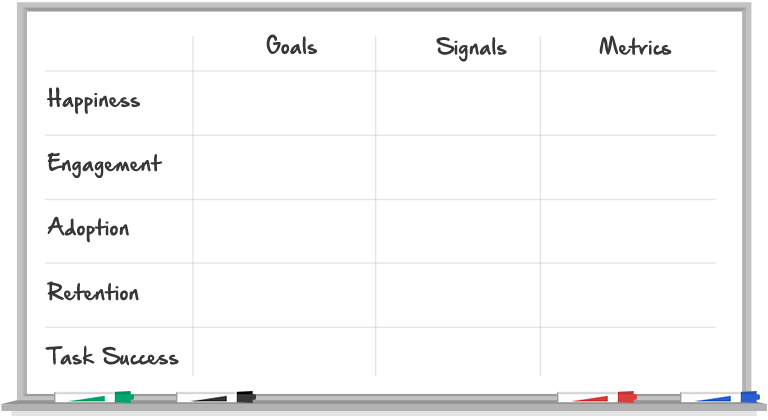
HEART Framework
Google’s HEART approach for UX metrics is designed to be a flexible framework for measuring the user experience of a product, or specific feature within a product. The framework is grounded by five principles: Happiness, Engagement, Adoption, Retention, and Task Success. These principles should be prioritized or de-prioritized based on the goals of the particular product; not all principles will always be relevant.
The framework is complemented by the Goals-Signals-Metrics structure, which helps to identify which metrics should be tracked. At the outset of a project, product goals should be classified into one (or none) of the five HEART principles, with corresponding signals and metrics identified. Signals are user actions that allow us to quantify whether that goal has been achieved (the “how”), while metrics are a measure of the number of signals achieved that allow for benchmarking (the “what”).
The HEART framework is the starting point, which is then tailored for the relevance of a particular product through the Goals-Signals-Metrics structure. GSM effectively makes metrics-tracking meaningful; it narrows the scope of all the metrics out there to the ones that are actually relevant for a product, while clearly connecting that metric to a broader product goal.
Read more about this framework.
Example (Product): MyCampus
To demonstrate this approach on a particular product, let’s consider the MyCampus prototype.
| Goals | Signals | Metrics | |
|---|---|---|---|
| Happiness | For the survey to be fun and pleasant for end-users | How someone feels after completing the survey | The average “happiness score” per survey** |
| Engagement | For the survey to be interesting and engaging for end-users | The number of pins / comments someone leaves | The average number of pins dropped per user per survey The average number of comments left per user per survey The average number of routes traced per user per survey |
| Adoption | For more Sasakians to use MyCampus on their projects.* | - | - |
| Retention | For Sasakians to be repeat-users of MyCampus on their projects.* | - | - |
| Success | For end-users to be able to effectively leave feedback about a place | The number of people completing the survey | The average completion rate (number of site visits compared to number of completed surveys)** |
*Product management / product strategy goal – not as directly related to UX / UI implications for end-users
**We don’t currently track these, but they perhaps should be tracked based on our product goals
Low scores for a particular MyCampus branch could indicate the need for a deep-dive investigation into how that survey was different from others (more questions, different questions, UI changes?) and how those differences impacted the end-user experience. Best practice guides should also be offered based on lessons learned from these metrics (i.e., we get the highest completion rates when there are no more than 15 questions) to guide the number of questions to use, types of questions to use, and preferred interface features. Alongside these user-focused metrics, it would be important to track non-user data on each MyCampus branch too (i.e., the number of questions, and which questions / icons are used) for diagnostic purposes.
Example (Feature): Hideo's Project Map "Edit" Function
To demonstrate this approach on a particular product feature, let’s consider Hideo’s project map.
| Goals | Signals | Metrics | |
|---|---|---|---|
| Happiness | For users to quickly and easily be able to edit / add project location data | Amount of time spent editing | Average length of time between clicking “edit”/“add” and “save” |
| Engagement | For people to be deeply engaged, make lots of edits / additions | Number of edits / additions per user | Average number of edits / additions per user per week |
| Adoption | For lots of people to use the “edit” feature | Number of unique visitors making edits | Percent of Sasakians making edits / additions each week |
| Retention | n/a | - | - |
| Success | For the data to become more complete* | - | - |
*Product management / product strategy goal – not as directly related to UX / UI implications for end-users
Good + Bad Examples
The Strategies team took some time (in 2017) to brainstorm both good and bad examples of UX; view the full list here.
Some of the best include:
Some of the worst include:
As we looked at these examples together, we summarized themes that represent good and bad UX; see the adjectives below.
Good UX is...
- Intuitive
- Easy
- Simple
- Functional
- Transparent
- Quick
- Organized
- Clean, uncluttered
- Aesthetically pleasing / visually engaging
- Educative
- Seamless integration of mixed media
- Smooth transitions
- Knowing how users interact with the site
- Smart use of typography
- Matches user’s mental model (NYT website/newspaper)
- Anticipates needs
- Doesn’t get in your way
Bad UX is...
- Ugly / gross / makes you ill
- Confusing
- Lots of steps
- Get stuck
- End up in a circular cycle
- Maze, not straightforward
- Frustrating
- Tries to do too much
- Too limited
- Overwhelming
- Complex
- Wasted space
- Hidden information
- Scroll-jacking
- Too much movement
- Wrong info at the wrong time
- Lack of consistency
- Mixed functionality
- Unclear terminology
Learn More
To learn more about usability, user experience, and all the sub-fields that come with, check out the following resources.
Join Sasaki’s UX Google+ Community!
Books:
- The User Experience Team of One -- Leah Buley
- Design of Everyday Things -- Don Norman
- 100 Things Every Designer Needs to Know About People -- Susan Weinschenk
- Don’t Make Me Think -- Steve Krug
- The Shape of Design -- Frank Chimero
- Lean UX -- Jeff Gothelf, Josh Seiden
- Plus many more
Newsletters / Blogs:
- Smashing Magazine: for both web designers and developers (offers newsletter too)
- UX Booth: for the user experience community (offers newsletter too)
- UX Collective: a curated list of Medium articles about UX (offers newsletter too)
- InVision: this is a prototyping tool, but their weekly newsletter is A+
Courses:
- Lynda: Sasaki has a subscription to this service which includes a ton of UX / UI courses.
- Skillshare offers a bunch of free courses on UI/UX Design.
- Gymnasium also offers a couple free courses on UX.
- HackDesign sends you a free design-based lesson to improve your skills every week.
- UX Design Edge features monthly free webinars about UX.
- General Assembly offers in-person (downtown Boston) and online courses on UX/UI design, several of which are free.
Professional Organizations:
Tools We Use
We regularly use the following UX tools (some free, some subscription). If you want to use any of these, reach out to IS or Strategies to get added to our team accounts.